
After 25 years of building software and countless hours watching users struggle with SaaS products, I've developed strong opinions about what works and what doesn't. The truth is, most UX design patterns SaaS companies use are copied from consumer apps that have entirely different goals. Your project management tool isn't Instagram. Your HR platform isn't TikTok. Stop designing like they are.
This article is part of our complete guide to SaaS product design.

At Dazlab.digital, we build niche SaaS products for specific industries — interior designers, HR teams, real estate associations. These aren't users who want to be "delighted" by clever animations. They want to get their work done and go home. The patterns I'm sharing here come from watching these professionals use our software every day, fixing what breaks, and iterating based on what actually helps them succeed.
Here's what I've learned: the best UX patterns are boring. They're predictable. They get out of the way. And most importantly, they solve real problems that cost real businesses real money. Let's dive into the 12 patterns that have proven themselves across every vertical SaaS product we've built.
1. The Progressive Disclosure Onboarding Pattern
Traditional SaaS onboarding is broken. Companies dump users into empty dashboards with tooltip tours pointing at features that don't matter yet. "Here's where you'll see your reports!" Great, but I don't have any data to report on. We've all clicked through these tours without reading a word, then immediately felt lost.
Progressive disclosure onboarding flips this approach. Instead of showing everything at once, you reveal features only when users need them. When we built our interior design software, we started users with just one action: create your first project. No dashboard. No menu full of options they don't understand yet. Just a single, clear next step.

The key insight here is that onboarding isn't about teaching features — it's about helping users achieve their first win. Every industry has a different definition of that first win. For HR managers, it might be posting their first job. For billing managers, it could be sending their first invoice. Design your onboarding around that specific outcome, not around your feature list.
2. The Smart Defaults Pattern for Data Entry
Watch any professional use enterprise software and you'll see the same thing: they're entering the same information over and over. Same client details. Same project types. Same billing rates. It's mind-numbing, and it's why so many SaaS products fail to get adopted — the overhead of using them outweighs the benefits.
Smart defaults solve this by learning from user behavior and pre-filling forms intelligently. But here's where most products get it wrong: they try to be too smart. They use complex algorithms to guess what users want, and they guess wrong just often enough to erode trust.

Our approach is simpler and more effective. We track the last 5 entries for each field and look for patterns. If an HR manager always posts jobs to the same 3 job boards, those become the defaults next time. If a project manager always assigns tasks to the same team members, we pre-select those assignees. But — and this is crucial — we make it obvious that these are defaults, not requirements. One click to change them, with the other options readily available.
We also let users set their own defaults explicitly. That little "Set as default" checkbox next to form fields? It's been in our products for years, and users love it. Sometimes the best SaaS UX solutions are the ones that give users control instead of trying to be clever. Trust your users to know their own workflows better than your algorithm does.
3. The Contextual Empty State Pattern
Empty states are where most SaaS products reveal they don't actually understand their users. You'll see generic messages like "No items yet!" with a cartoon illustration of an empty box. Helpful, right? These empty states treat all situations the same, whether it's a new user who doesn't know where to start or an experienced user who's filtered their data down to nothing.
Contextual empty states adapt based on why the space is empty. New user? Show them exactly how to add their first item, with a direct link to do it. Filtered search with no results? Suggest adjusting filters or show similar items that didn't quite match. Deleted all items? Offer to restore recently deleted ones.

When we built our real estate association software, we discovered members would often search for resources that didn't exist yet. Instead of showing "No results found," we added a "Request this resource" button. Association administrators could see what members were looking for and prioritize creating those resources. A simple pattern turned a dead-end into valuable user feedback.
The lesson here extends beyond empty states. Every "error" or "no result" scenario is an opportunity to guide users toward success. Stop treating these moments as failures and start designing them as waypoints. Your users will thank you, and your support tickets will plummet.
4. The Inline Editing Pattern That Actually Works
Inline editing promises to save clicks and keep users in flow. Click on text, edit it right there, save automatically. Sounds great until you watch real users accidentally edit things they didn't mean to, lose changes because auto-save failed, or worse — not realize they can edit at all because there's no visual affordance.
The inline editing pattern that actually works has three critical components most implementations miss. First, explicit edit affordances — on hover, show a subtle edit icon or underline. Users need to know they can edit before they click. Second, clear edit states — when editing, the field should look obviously different from its read state. Add a border, change the background, do something to signal "you're now editing." Third, and most important: explicit save/cancel actions. Auto-save is fine as a backup, but users need control. They need to know their changes are saved.
We learned this the hard way with our content management system. Writers were losing work because they'd click away before auto-save kicked in. Adding simple "Save" and "Cancel" buttons to inline editing increased user confidence dramatically. Yes, it's an extra click. But it's a click that prevents data loss and angry support tickets.
5. The Multi-Level Navigation Pattern for Complex Products
SaaS products start simple and grow complex. What begins as 5 features becomes 50. The clean navigation that worked at launch becomes a cluttered mess. Most products respond by adding more items to their main nav until it looks like a restaurant menu. Others hide everything behind a hamburger menu, making features impossible to discover.
Multi-level navigation solves this through progressive disclosure (seeing a pattern here?). Primary navigation shows only top-level sections. Once users enter a section, secondary navigation appears with options specific to that context. Working on projects? See project-related tools. Managing billing? See financial options. The key is maintaining consistent positioning — primary nav always in the same place, secondary nav always in its place.

But here's the critical addition most products miss: a persistent breadcrumb that serves as both wayfinding and navigation. Users can see exactly where they are and jump to any level instantly. When we added this to our HR platform, the number of "I can't find..." support tickets dropped by 70%. Users weren't lost anymore because they always had a clear path back to familiar territory.
The best navigation patterns respect cognitive load. Users shouldn't have to remember where features live. They should flow naturally from section to section, with the interface revealing options as needed. This is especially critical for the managers and administrators who make up much of our user base — they're juggling multiple responsibilities and don't have time to hunt for features.
6. The Smart Notification Pattern
Notifications in most SaaS products are broken. They're either overwhelming (every tiny action triggers an alert) or useless (critical issues get buried in noise). We've all turned off notifications for products that couldn't figure out the difference between "someone viewed your report" and "your payment failed." This is inexcusable when you're building software for professionals who rely on timely information.
Smart notifications require three layers of intelligence. First, categorization by urgency: critical (requires immediate action), important (should handle today), and informational (nice to know). Second, delivery method matching urgency: critical goes to email and in-app, important stays in-app with a badge, informational lives in a notification center. Third, and this is what most products miss, user control over what qualifies for each category.
When we built notification systems for our agency clients, we discovered every team has different definitions of "urgent." For one design firm, client feedback was critical. For another, it was important but not urgent. Instead of guessing, we let teams define their own notification rules. But — and this is crucial — we provided smart defaults based on role. Project managers see task delays as critical. Billing managers see payment issues as critical. Start with intelligent defaults, then let users customize.
The other pattern that's proven invaluable is notification batching. Instead of sending 15 emails about 15 tasks, we batch them into a single "Your morning update" email. Users get all their information without email fatigue. One agency owner told us this single feature made them love our product — finally, a SaaS tool that respected their inbox.
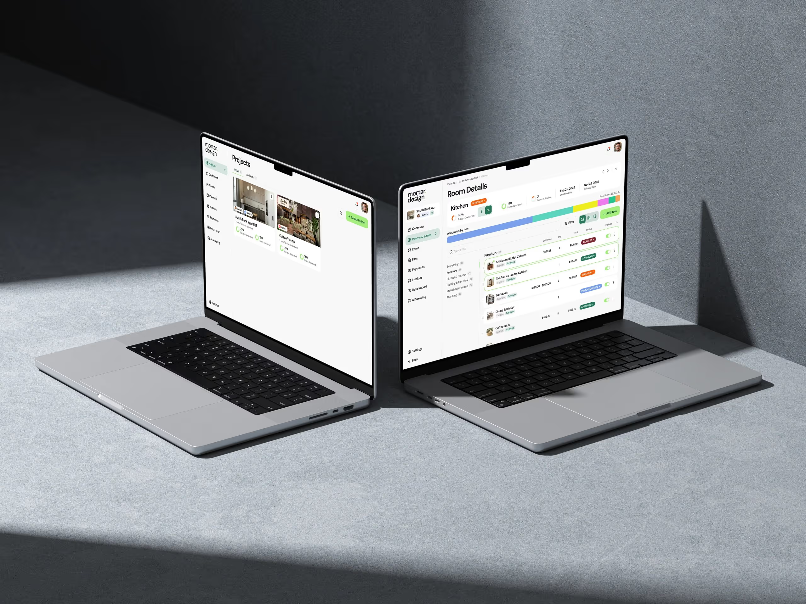
7. The Flexible Dashboard Pattern

Flexible dashboards solve this through role-based defaults combined with full customization. When an HR manager logs in, they see recruiting pipeline metrics. When a billing manager logs in, they see revenue and outstanding invoices. But here's the key: these are starting points, not rigid templates. Users can add, remove, resize, and rearrange widgets to match their actual workflow.
We take this further with saved dashboard states. Working on recruiting? Switch to your recruiting dashboard. End of month billing? Switch to your financial dashboard. Users create different layouts for different contexts and switch between them instantly. This isn't just about customization — it's about recognizing that the same user has different needs at different times.
The implementation details matter here. Drag-and-drop has to be buttery smooth. Widgets need to resize intelligently. Most importantly, the system has to remember everything perfectly — nothing frustrates users more than spending time customizing a dashboard only to have it reset randomly. We spent months getting this right, and it's become one of our most-loved features across every vertical we serve.
8. The Progressive Form Pattern
Long forms are conversion killers, but complex SaaS products need lots of information. The typical solution — multi-step wizards — often makes things worse. Users can't see the full scope, can't skip ahead to relevant sections, and lose context between steps. We've all abandoned a multi-step form because step 3 asked for information we didn't have ready.
Progressive forms show everything upfront but reveal complexity gradually. Start with essential fields visible and optional sections collapsed. As users fill out basics, relevant advanced options appear. Working on a project for a repeat client? Client details auto-populate and billing section expands with their preferred rates. First-time setup? Those sections stay collapsed until needed.
The magic is in the logic that determines what to show when. This isn't about hiding fields — it's about showing the right fields at the right time. When an interior designer creates a project, we don't show budget tracking fields until they indicate it's a billable project. When an HR manager posts a job, we don't show remote work policies until they mark it as remote-eligible. Every field appears exactly when it becomes relevant, not before.
We also learned to be transparent about progress. A simple indicator showing "2 of 3 sections complete" reduces abandonment dramatically. Users know exactly what's left and can make informed decisions about whether to continue now or save for later. Speaking of which — always, always allow saving partially completed forms. The number of times professionals get interrupted mid-task would shock you.
9. The Bulk Action Pattern That Doesn't Overwhelm
Professionals don't work with data one item at a time. They need to update 20 projects, archive 50 candidates, or reassign 30 tasks. Yet most SaaS products treat bulk actions as an afterthought — a checkbox column and a dropdown menu with every possible action crammed in. Users end up afraid to use bulk actions because the consequences aren't clear.
Effective bulk action patterns start with progressive disclosure of actions based on selection. Select one item? Show all possible actions. Select multiple items of different types? Show only actions that apply to all. Select 100 items? Add warnings about the impact. This contextual filtering prevents errors and builds confidence.
But the real innovation is in the confirmation step. Instead of a generic "Are you sure?" dialog, we show exactly what will happen: "This will archive 23 projects and notify 5 team members. Archived projects can be restored within 30 days." Specific numbers. Clear consequences. Undo information. Users proceed with confidence instead of anxiety.
We also implemented bulk action templates for common workflows. HR managers repeatedly mark candidates as "reviewed" and move them to the next stage. Instead of selecting, choosing an action, and confirming every time, they can save this as a "Review and advance" template. One click to apply a saved set of bulk actions. This is the kind of UX design patterns SaaS users actually thank you for.
10. The Search Pattern That Understands Intent
Most SaaS search is just matching text strings. Users search for "overdue invoices" and get nothing because the field is labeled "past due." They search for a client by company name and miss results because the record uses their personal name. It's frustrating and makes users feel like the software is working against them.
Intent-based search goes beyond text matching to understand what users actually want. When someone searches "invoices from last month," they're not looking for the words "last month" in an invoice — they want a date range query. When they search "John from Acme Corp," they want records associated with either John OR Acme Corp, not just exact matches.
We build this through search query templates that match common patterns. Dates trigger date range searches. Dollar amounts trigger numeric comparisons. Company names search across multiple related fields. But here's the key: we show users how we interpreted their search. "Showing invoices between Oct 1-31" or "Searching for 'John' in names and 'Acme Corp' in companies." This transparency builds trust and helps users refine their queries.
The other critical pattern is search context persistence. When a project manager searches for "delayed tasks" and clicks into one, then backs out, they should return to their search results, not an empty search box. Same scroll position. Same filters. Same everything. This seems basic, but most SaaS products reset everything and force users to search again. It's death by a thousand papercuts.
11. The Error Prevention Pattern
Error messages are too late. By the time users see "Invalid date format," they're already frustrated. The best error handling prevents errors from happening in the first place. This isn't about validation — it's about guiding users toward success before they can fail.
Input masks and formatters handle the basics. Phone numbers automatically format as users type. Dates show the expected format and auto-correct common mistakes (we all type 2/31 sometimes). Currency fields add commas and decimal places. But modern error prevention goes deeper. If users consistently enter dates in the "wrong" format, the system learns and accepts their preferred format.
Contextual limits prevent logical errors. Scheduling a meeting? The system knows not to suggest times outside business hours (unless you've scheduled outside hours before). Setting a project deadline? It warns if it's before any task deadlines. Assigning work? It shows team member capacity. These aren't hard blocks — users can override them. But the system helps them spot potential issues before they become real problems.
We also implemented what we call "undo everywhere." Deleted something? Toast notification with an undo button. Changed a setting? Same thing. Bulk updated records? You get the idea. Users explore features fearlessly when they know mistakes are easily reversible. This psychological safety dramatically increases feature adoption.
12. The Performance Perception Pattern
Actual performance matters, but perceived performance matters more. Users will happily wait 3 seconds for a result if the interface communicates what's happening. They'll rage-quit after 1 second if the interface freezes with no feedback. Most SaaS products get this backwards, optimizing backend performance while ignoring frontend perception.
Skeleton screens changed everything for our products. Instead of showing a spinner while loading, we show the shape of incoming content. Users see exactly where their data will appear and feel like the interface is already responding. Loading a report? Show the chart containers and table structure immediately, then fill in the data. It feels faster even when it isn't.
Progressive data loading takes this further. Show what's ready immediately and fill in the rest as it arrives. Dashboard widgets load independently. Search results appear as they're found. Large datasets virtualize to show visible rows instantly. Users start working with partial data instead of waiting for everything to load.
But the pattern that surprised us most was the power of transitions. Smooth animations between states make actions feel faster. A drawer sliding open feels quicker than it appearing instantly. A smooth scroll to new content feels faster than a jarring jump. These micro-interactions seem like fluff until you watch users work 8 hours a day in your software. Those smooth transitions reduce fatigue and make the whole experience feel more responsive.
The Patterns Are Just the Beginning
These 12 patterns have proven themselves across every vertical SaaS product we've built at Dazlab.digital. But here's what matters more than any specific pattern: understanding your users' actual workflows and designing to support them. The best SaaS UX solutions don't come from design inspiration sites or competitor teardowns. They come from watching real professionals use your software to do real work.
Every industry has unique needs. Interior designers need visual tools. HR managers need compliance features. Billing managers need audit trails. But they all share common frustrations with software that makes them work harder instead of smarter. These patterns address those universal frustrations while leaving room for vertical-specific solutions.
If you're building SaaS products and struggling with user adoption, start here. Pick the patterns that address your users' biggest pain points. Implement them thoughtfully, not blindly. And most importantly, watch how real users interact with them. The best UX patterns are the ones that evolve based on actual usage, not theoretical best practices.
Ready to build SaaS products that professionals actually want to use? At Dazlab.digital, we specialize in creating vertical SaaS solutions that solve real problems for real industries. Let's talk about how these UX patterns could transform your product.
Frequently Asked Questions
What makes these UX patterns specifically suited for SaaS rather than consumer apps?
These patterns prioritize efficiency and professional workflows over engagement metrics. SaaS users need to complete tasks quickly and accurately, not spend more time in the app. Features like smart defaults, bulk actions, and flexible dashboards address the repetitive, complex work that professionals do daily, which consumer apps rarely need to handle.
How do I know which patterns to implement first in my SaaS product?
Start by identifying your users' biggest workflow friction points through support tickets and user observation. If users complain about repetitive data entry, implement smart defaults. If they can't find features, fix your navigation. The patterns that address the most painful and frequent problems should be your priority.
Can these patterns work for both simple and complex SaaS products?
Yes, these patterns scale with your product complexity. A simple SaaS might only need basic versions of smart defaults and contextual empty states. As you add features, you can implement multi-level navigation and flexible dashboards. The key is starting with simple implementations and expanding as your product grows.
How do skeleton screens and progressive loading actually improve perceived performance?
Skeleton screens show users exactly where content will appear, making the interface feel immediately responsive even while data loads. This eliminates the anxiety of staring at a blank screen or spinner. Combined with progressive loading that shows partial results quickly, users can start working sooner even if all data isn't ready yet.
What's the most important thing to remember when implementing these UX patterns?
Always prioritize your users' actual workflows over theoretical best practices. These patterns are starting points, not rigid rules. Watch how your specific users work, adapt the patterns to fit their needs, and always provide escape hatches like undo functions and customization options. The best UX respects that users know their jobs better than you do.
Related Reading

Dazlab is a Product Studio_
Our products come first. Consulting comes second. Whichever path you take, you’ll see how a small team can deliver outsized results.