After building SaaS products for 25 years, I've watched countless users abandon perfectly good software in their first five minutes. Not because the product was bad—because the onboarding was.
This article is part of our complete guide to SaaS product design.

Here's what I've learned: great onboarding isn't about showing every feature. It's about getting users to their first win as fast as possible. The best SaaS products understand this. They don't overwhelm new users with tours and tooltips. They guide them to immediate value.
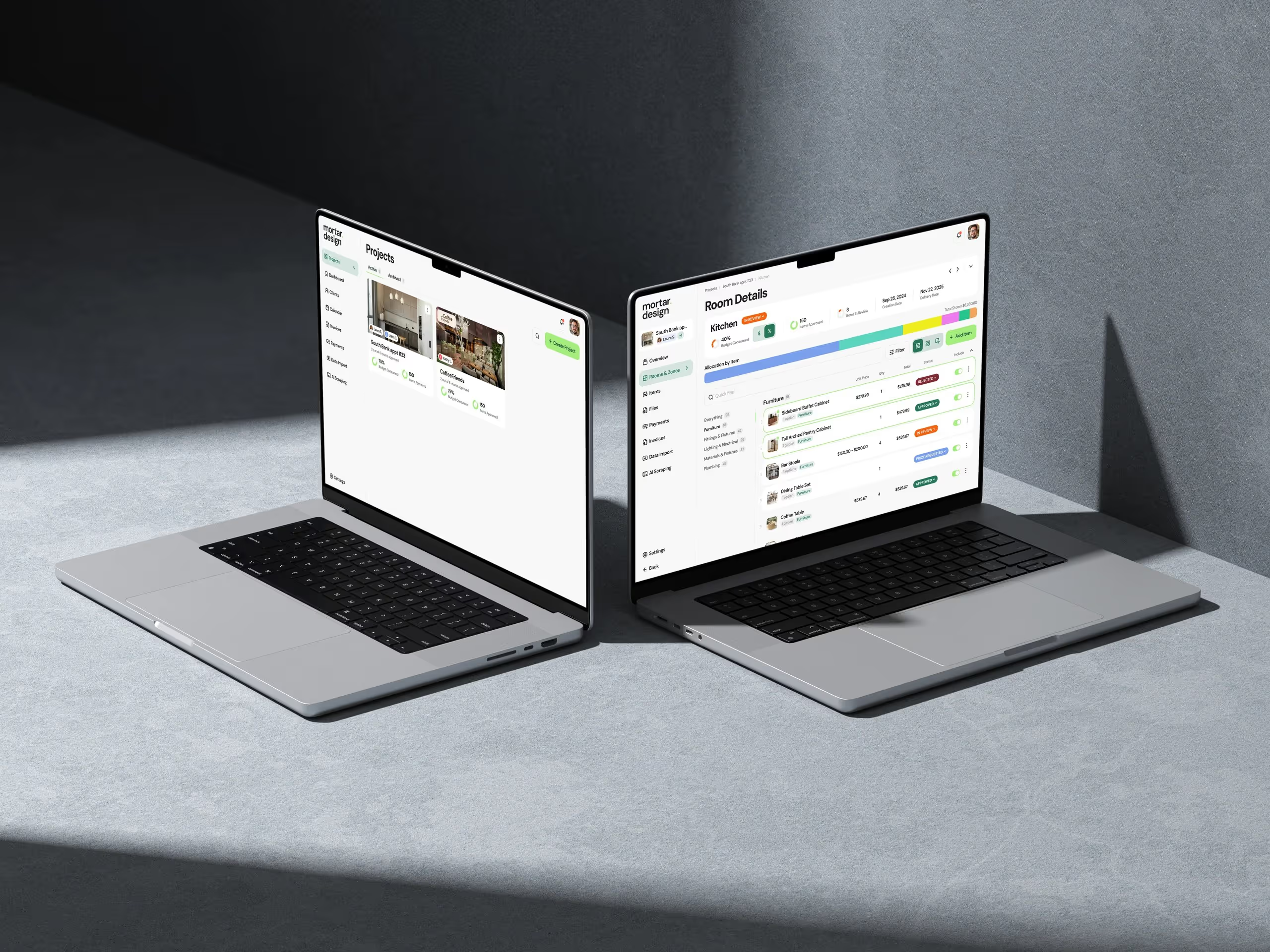
At Dazlab.digital, we've built onboarding flows for everything from HR tech to real estate software. Some converted at 65%. Others barely hit 15%. The difference? Understanding what users actually need in those critical first moments versus what we think they need.
The Psychology Behind First Impressions
Users don't sign up for your SaaS because they want to learn software. They sign up because they have a problem that's painful enough to overcome their natural resistance to change. Your onboarding needs to respect that urgency.
Think about it from their perspective. An HR manager trying your recruiting software isn't excited about setting up integrations. They're drowning in resumes and need to fill a critical role yesterday. An interior designer testing project management software doesn't care about your advanced reporting features. They need to track their current project before they lose another client deadline.
The most successful onboarding flows we've built start by asking one simple question: "What's the smallest useful thing this user can accomplish in under two minutes?" For a billing platform we developed, that meant letting users create and send their first invoice before even verifying their email. Conversion jumped 40% overnight.

Progressive Disclosure: The Art of Not Overwhelming
One of the biggest mistakes I see in SaaS onboarding is what I call the "kitchen sink approach"—throwing every feature at users from day one. It's like teaching someone to drive by explaining how the engine works. They don't need to know about valve timing. They need to know which pedal makes it go.
Progressive disclosure means revealing complexity gradually, as users demonstrate readiness for it. We implemented this for a vertical SaaS product in the real estate space. Version one of the onboarding asked users to configure 14 different settings before they could use the software. Completion rate? 12%.

We rebuilt it to ask for exactly three things: property type, location, and one key metric they wanted to track. Everything else became optional or was intelligently defaulted based on those three inputs. Completion rate shot up to 71%. More importantly, 30-day retention increased by 25% because users weren't overwhelmed on day one.
The key is understanding the natural progression of user sophistication. New users need different things than power users. A project manager using your software for the first time needs to create one project successfully. After they've done that five times, then you can introduce batch operations and automation rules.
"The best onboarding is invisible. Users shouldn't feel like they're being onboarded—they should feel like they're already using the product to solve their problem."
This principle has guided every onboarding flow we've designed at Dazlab.digital. We measure success not by how many features users discover, but by how quickly they achieve their first meaningful outcome.
The Power of Sensible Defaults
Here's something most product teams get wrong: they think customization equals user satisfaction. So they build onboarding flows that ask users to make 20 decisions before they can even start. What timezone? What date format? What color theme? What notification preferences?
Users don't want to make decisions. They want to solve problems. Every unnecessary choice during onboarding is a potential abandonment point. Smart defaults eliminate this friction.
When we built an AI-native applicant tracking system, we studied how HR managers actually worked. Turns out, 90% used the same basic workflow: post job, review applications, schedule interviews, make offer. So that's what we made the default. No choosing between "workflow templates." No "customizing your pipeline stages." Just a sensible starting point that worked for most users out of the box.

The users who needed something different? They'd figure out how to customize it later, after they'd already experienced value from the product. By that point, they were invested enough to spend time on configuration. But forcing that investment upfront is a conversion killer.
Another example: date formats. Instead of asking users to choose between MM/DD/YYYY and DD/MM/YYYY, we detect their location and set it automatically. Seems obvious, but you'd be amazed how many SaaS products still ask this question during onboarding. It's lazy product thinking disguised as "flexibility."
Measuring What Matters: Beyond Completion Rates
Most teams measure onboarding success by completion rate. That's like measuring a restaurant by how many people walk through the door. What matters is whether they become regulars.
The metrics that actually predict long-term SaaS success are different. We track "time to first value"—how long it takes a user to achieve something meaningful. For that billing software I mentioned, it's sending their first invoice. For the ATS, it's posting their first job. This metric tells you if your onboarding is actually working.
Another critical metric: activation depth. It's not enough that users complete one action. The question is whether they complete enough actions to form a habit. Our data across multiple products shows a clear pattern: users who complete at least three core actions in their first session have 4x higher retention at 90 days.
We also track "feature discovery velocity"—not because we want users to discover every feature, but because we want to understand the natural progression. If 80% of successful users discover feature X by week two, but only 20% of churned users do, that tells us something important about our onboarding sequence.
The worst metric to optimize for? Tutorial completion. I've seen products with 95% tutorial completion and 10% 30-day retention. Users will click through your tutorial to make it go away. That doesn't mean they learned anything or found value.
Real Examples That Actually Convert
Let me share some specific patterns we've seen work across different types of SaaS products. These aren't theoretical—they're based on actual products we've built or consulted on.
The "Work Backwards" Approach: For a content management system we built for digital agencies, we flipped traditional onboarding on its head. Instead of starting with "create an account," we let users start by uploading content. Only after they saw their content in the system did we ask them to create an account to save it. Conversion increased 55%.
This works because it respects the user's mental model. They came to manage content, not to fill out forms. Let them do what they came for, then handle the administrative stuff.
The "Guided Sprint" Pattern: For complex B2B software, we've had success with time-boxed onboarding sprints. Instead of an endless checklist, users get a focused goal: "Set up your first project in the next 10 minutes." The time constraint creates urgency and prevents overthinking.
We used this for a project management tool targeted at interior designers. The onboarding focused on getting one real client project into the system—not learning every feature. Once designers saw their actual project organized in the software, adoption skyrocketed.
The "Success State" Preview: Sometimes the best onboarding shows users where they're headed. For an HR tech product, we created a "demo mode" that showed a fully populated system with sample data. Users could explore what success looked like before starting their setup.
This violated conventional wisdom about keeping onboarding linear, but it worked. Users understood the end goal and were more motivated to complete setup steps when they knew what they were building toward.
Common Patterns to Avoid
After years of building SaaS products, I've developed a strong allergy to certain onboarding patterns. They're popular because they're easy to implement, not because they work.
The Feature Tour: Those overlay tours that point at every button on the screen? Users hate them. Our testing shows less than 15% of users complete them, and those who do retain almost nothing. If your interface needs a tour to be understood, the problem isn't onboarding—it's your UX.
The Empty State Overwhelm: Nothing kills momentum like logging into a new product and seeing 20 different "quick start" options. Analysis paralysis is real. Give users one clear next step, not a buffet of choices.
The Premature Upsell: I've seen products try to upsell premium features during onboarding. This is like a car dealer trying to sell you extended warranty before you've turned the key. Let users experience core value first. They can't appreciate premium features until they understand basic ones.
The Data Import Marathon: "Import your data to get started!" sounds helpful until users spend 45 minutes cleaning CSVs and mapping fields. For one product, we moved data import to week two of the user journey. New users started with manual entry (faster for small amounts) and imported bulk data only after they understood the system.
These patterns persist because they seem logical from the product team's perspective. But onboarding isn't about what makes sense to you—it's about what works for users in their moment of need.
Building Onboarding Into Your Product Strategy
Here's the thing most teams miss: onboarding isn't a feature you bolt on after launch. It's a core part of your product strategy that should influence every design decision.
When we're building a new SaaS product at Dazlab.digital, we design the onboarding experience in parallel with the core features. This prevents the common problem of building a powerful product that's too complex for new users to adopt.
Take our recent work on an AI-native solution for recruiting. Instead of building every possible feature and then figuring out how to teach them, we asked: "What's the minimum viable workflow that delivers value?" That became both our MVP and our onboarding flow. Additional features were designed as progressive enhancements that users could discover naturally.
This approach requires discipline. It's tempting to add complexity, especially when you're building for sophisticated users. But even power users were beginners once. If they can't get through your onboarding, they'll never become the advanced users you're designing for.
The best SaaS products feel simple on day one and reveal their depth over time. That's not an accident—it's the result of thoughtful onboarding strategy baked into the product from the start.
The Path Forward

Stop thinking about onboarding as user education. Start thinking about it as the fastest path to user success. Stop measuring completion rates. Start measuring time to value. Stop adding features to your onboarding. Start removing friction from your product.
The SaaS products that win aren't necessarily the most powerful—they're the ones that users can actually adopt. In a world where switching costs are dropping and alternatives are multiplying, your onboarding experience might be your biggest competitive advantage.
At Dazlab.digital, we've learned these lessons the hard way, through years of building and rebuilding onboarding flows. If you're struggling with user adoption or building a new SaaS product from scratch, remember: your users' first experience shapes everything that follows. Make it count.
Ready to build SaaS products that users actually adopt? Let's talk about how thoughtful product strategy and user-centered design can transform your software from powerful to profitable.
Frequently Asked Questions
What's the most important metric for measuring SaaS onboarding success?
Time to first value is the critical metric. Track how long it takes users to achieve something meaningful in your product—like sending their first invoice or posting their first job. This predicts retention far better than tutorial completion rates. Users who complete at least three core actions in their first session show 4x higher retention at 90 days.
Should I use product tours and tooltips in my SaaS onboarding?
Generally, no. Testing shows less than 15% of users complete overlay tours, and those who do retain almost nothing. If your interface needs a tour to be understood, the problem is your UX, not your onboarding. Focus instead on progressive disclosure—revealing features gradually as users demonstrate readiness for them.
How do I balance customization options with onboarding simplicity?
Use smart defaults based on user research. For example, detect location to set date formats automatically, or provide a standard workflow that works for 90% of users out of the box. Let power users customize later, after they've experienced core value. Every unnecessary choice during onboarding is a potential abandonment point.
When should I ask users to import their data?
Not during initial onboarding. Move data import to week two of the user journey. New users should start with manual entry for small amounts of data to understand your system first. Asking users to spend 45 minutes cleaning CSVs before they've seen any value kills conversion rates.
How do I know if my onboarding is too complex?
Look at your completion rates and activation depth. If less than 50% of users complete onboarding, or if users aren't completing multiple core actions in their first session, you're asking for too much upfront. The best test: can a new user achieve something meaningful in under two minutes? If not, simplify.
Related Reading
Dazlab is a Product Studio_
Our products come first. Consulting comes second. Whichever path you take, you’ll see how a small team can deliver outsized results.