
I've spent the last 25 years building software products, and here's what I've learned: most B2B SaaS products fail because they ignore fundamental design principles. Not because the tech stack was wrong. Not because the market wasn't ready. They fail because the product design doesn't actually solve the user's problem.
This article is part of our complete guide to SaaS product design.
At Dazlab.digital, we've built everything from HR tech platforms to real estate association software. We've seen what works and what doesn't. More importantly, we've learned that successful B2B product design isn't about following trendy UI patterns or copying what Slack did last year.
It's about understanding five essential elements that make or break your product. Get these right, and you'll build something people actually want to use. Get them wrong, and you'll join the graveyard of "beautiful" products that nobody adopts.
1. Workflow-First Architecture: Design for How Work Actually Happens
Here's the biggest mistake I see: teams design features, not workflows. They build a beautiful invoice creator, a slick project tracker, a gorgeous dashboard — then wonder why adoption stalls at 20%.
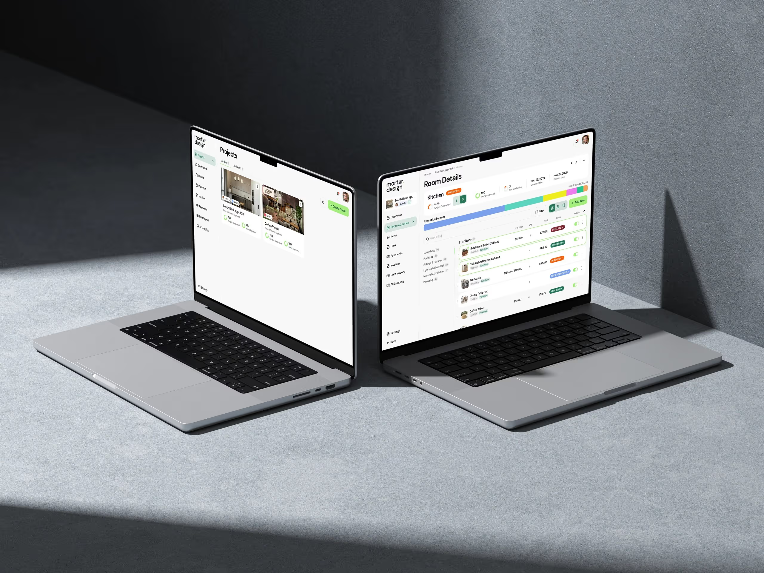
The problem? They're forcing users to adapt their work to the software, instead of adapting the software to how work actually happens. When we built TaliCMS for real estate associations, we didn't start with features. We started by mapping how association administrators actually manage content. Turns out, they don't think in terms of "pages" and "posts" like traditional CMS platforms assume. They think in terms of member communications, event announcements, and regulatory updates.
So we designed TaliCMS around those workflows. Instead of a generic content editor, we built specific tools for each type of communication they handle. The result? Content updates that used to take hours now take minutes. Not because we made a faster editor — because we designed for their actual workflow.
Your users don't care about your feature list. They care about getting their job done faster and with less friction.
This principle applies across every vertical. When building HR tech, map the actual hiring workflow — from job posting to onboarding. When building agency software, understand how projects move from pitch to delivery. The elements of product design that matter most are the ones that mirror real work patterns.
2. Progressive Disclosure: Show the Right Information at the Right Time
B2B users aren't casual browsers. They're professionals trying to accomplish specific tasks under time pressure. Yet most B2B interfaces throw everything at them at once — every option, every setting, every possible action.

We learned this lesson the hard way with an early version of our agency billing platform. We packed the dashboard with every metric we could track. Project profitability, resource utilization, payment status, invoice aging — all visible at once. Users hated it. Not because the data wasn't valuable, but because it was overwhelming when they just needed to send an invoice.
The solution? Progressive disclosure. Show users exactly what they need for their current task, with the ability to drill deeper when necessary. In the billing platform, we redesigned the interface to show pending invoices first, with one-click access to send. Advanced metrics? They're there, but tucked behind a "View Analytics" option that power users love and casual users can ignore.
This principle extends beyond dashboards. In form design, start with required fields and reveal optional ones based on user choices. In navigation, surface primary actions prominently and nest secondary ones. The goal isn't to hide functionality — it's to reduce cognitive load by presenting information progressively.
The 80/20 Rule of Interface Design
Here's what we've found across dozens of products: 80% of users need 20% of your features 80% of the time. Design for that reality. Make the common tasks dead simple, even if it means adding an extra click for advanced functions.
When we apply B2B SaaS design principles like this, something interesting happens. Support tickets drop. Feature requests become more specific. Users stop asking "how do I..." and start saying "it would be great if..." — that's when you know you've nailed the progressive disclosure balance.
3. Data Density Without Overwhelm: The Information Architecture Challenge
B2B users need access to lots of data. Unlike consumer apps where simplicity reigns supreme, professional tools need to surface complex information. The challenge? Presenting dense data without creating visual chaos.
We faced this challenge building a recruiting platform for staffing agencies. Recruiters need to see candidate skills, availability, pay rates, location preferences, past placements, and client feedback — often for dozens of candidates at once. Our first design tried to simplify by hiding most of this data. Recruiters revolted. They needed that information to make quick decisions.
The solution wasn't less information — it was better information architecture. We developed what we call "scannable density" — layouts that pack in data while maintaining visual hierarchy. Key techniques include consistent data positioning (salary always in the top right, availability always as a color-coded bar), smart use of progressive disclosure (hover for details, click for full history), and contextual grouping (related data points clustered together).
We also learned that data density tolerance varies by user role and experience. New users need more white space and clearer labels. Power users want compact views with keyboard shortcuts. The answer? Let users choose their density level. We now build three view modes into data-heavy interfaces: Comfortable (for new users), Standard (for regular use), and Compact (for power users).
The Cognitive Load Calculator
Here's a framework we use: for every piece of information you add to a screen, ask three questions. Does the user need this to make a decision? Can it be derived from other visible data? Would hiding it require an extra step that interrupts workflow? If you answer yes, no, yes — include it. Otherwise, it's probably noise.
This approach to elements of product design has dramatically improved user satisfaction scores. In our recruiting platform, time-to-decision dropped by 40% after we redesigned the candidate comparison view using these principles.
4. Context-Aware Interactions: Design for the User's Mental State
B2B users aren't sitting quietly at pristine desks, carefully considering each click. They're juggling Slack messages, taking calls, and fighting fires. Your product design needs to account for this reality.
We learned this building project management software for digital agencies. Our initial design assumed users would thoughtfully complete each field in our project brief form. Reality check: project managers were usually filling these out during client calls, with half their attention elsewhere. They'd start a brief, get interrupted, come back hours later and have no idea where they left off.
The fix? Context-aware interactions. The form now auto-saves every 30 seconds with a subtle indicator. When users return, we show them exactly where they stopped with a friendly "Welcome back, you were working on the budget section" message. We added smart defaults based on similar projects. We even built in a "quick brief" mode for those chaotic moments when you just need to capture the basics.
This principle goes beyond forms. Error messages should explain what went wrong AND how to fix it. Confirmation dialogs should summarize what's about to happen in plain language. Loading states should indicate progress, not just spin endlessly. Every interaction should acknowledge the user's context and mental state.
The Interruption Test
Here's how we validate context-aware design: we literally interrupt ourselves. Start a task in your product, then walk away for 10 minutes. Can you immediately resume where you left off? Is your previous context preserved? If not, your design isn't accounting for real-world usage.
We've found that strong B2B SaaS design principles must include interruption resilience. It's not sexy, but it's the difference between software people tolerate and software people love.
5. Outcome-Driven Navigation: Structure Around Goals, Not Features
Most B2B products organize navigation around features. You'll see menu items like "Projects," "Invoices," "Reports," "Settings." Logical? Sure. Helpful? Not really. Because users don't think in features — they think in outcomes.
When we redesigned navigation for an interior design project platform, we initially followed the standard pattern. Designers ignored it and kept calling support asking how to "present to clients" or "track project costs." The features were all there, just organized in a way that didn't match their mental model.
So we flipped the script. Instead of feature-based navigation, we created outcome-based navigation. Menu items became "Plan a Project," "Present to Clients," "Manage Vendors," and "Track Profitability." Each section contains multiple features, but they're organized around what the user is trying to accomplish.
This shift had an immediate impact. Feature adoption increased across the board because users could actually find what they needed. Support tickets dropped by 60%. Most tellingly, users started exploring parts of the product they'd never touched before, simply because the navigation finally made sense to them.
The Job-to-be-Done Navigation Test
Here's how to validate your navigation: ask five users to complete common tasks without any guidance. If they can't find the right starting point within 10 seconds, your navigation is organized around your mental model, not theirs.
We've rebuilt navigation for dozen of products using this principle. Every time, the same pattern emerges: feature-based navigation makes sense to product teams, outcome-based navigation makes sense to users. The elements of product design that truly matter are the ones that align with user goals, not product architecture.
The Path Forward: Building Products People Actually Use
After 25 years of building B2B SaaS products, I've seen every trend come and go. Flat design, skeuomorphism, dark mode, animated everything. But these five elements remain constant because they're not about aesthetics — they're about understanding how professionals actually work.

Get these five elements right, and you'll build products that solve real problems for real people. That's not just good design — it's good business.
Want to see these principles in action? Let's talk about your next product. We're selective about the projects we take on, but if you're serious about building B2B software that actually works for your users, we should connect. Because there are enough pretty products in the world that nobody uses. It's time to build something that matters.
Frequently Asked Questions
What's the difference between workflow-first architecture and feature-based design?
Workflow-first architecture designs around how users actually complete tasks, mapping their natural work patterns. Feature-based design organizes around individual capabilities without considering how they connect. For example, TaliCMS succeeded because it was built around how association administrators think about communications (member updates, events, regulations) rather than generic content types.
How do you determine the right level of data density for B2B interfaces?
Start by identifying what information users need to make decisions, then offer multiple view modes. We typically build three levels: Comfortable for new users with more white space, Standard for regular use, and Compact for power users. The key is using consistent positioning, smart grouping, and progressive disclosure to maintain scannability even in dense layouts.
What are context-aware interactions and why do they matter?
Context-aware interactions acknowledge that B2B users are frequently interrupted and multitasking. They include features like auto-save with clear progress indicators, resumption messages that remind users where they left off, and error messages that explain both the problem and solution. This design approach reduces frustration and prevents lost work.
How do you transition from feature-based to outcome-based navigation?
Map your features to user goals by asking "what is the user trying to accomplish?" Instead of menu items like "Reports" or "Settings," use action-oriented labels like "Track Profitability" or "Present to Clients." Test with real users by asking them to complete tasks without guidance — if they can't find the right starting point quickly, your navigation needs restructuring.
Which of these five elements should B2B product teams prioritize first?
Start with workflow-first architecture because it impacts every other design decision. Once you understand how work actually flows, you can make informed choices about information density, progressive disclosure, context awareness, and navigation structure. Without this foundation, you risk building features that don't connect to real user needs.
Related Reading

Dazlab is a Product Studio_
Our products come first. Consulting comes second. Whichever path you take, you’ll see how a small team can deliver outsized results.