After 25 years of shipping software and building SaaS products for everyone from interior designers to HR teams, I've learned one thing: most product design advice is written by people who've never actually built anything. They'll tell you about double diamonds and design thinking workshops while your competitors are shipping features.
This article is part of our complete guide to SaaS product design.
Here's what actually works. This is the exact SaaS design process we use at Dazlab.digital when building niche products like our interior design workflow tool or custom HR platforms. No theory. No fluff. Just the process that gets products from idea to paying customers.
Stage 1: Problem Discovery (Not Market Research)
Most teams start by analyzing TAM and building competitor matrices. We start by talking to people who are pissed off about their current tools. When we built our billing management system for agencies, we didn't commission a market study. We sat with billing managers who were losing their minds over payment disputes and manual invoice tracking.
Here's how we run problem discovery: Find 10-15 people in your target niche who actively hate their current solution. Not mildly frustrated. Actively hate it. Schedule 30-minute calls and ask them to screen share while they do their most painful task. Don't pitch anything. Just watch them struggle.
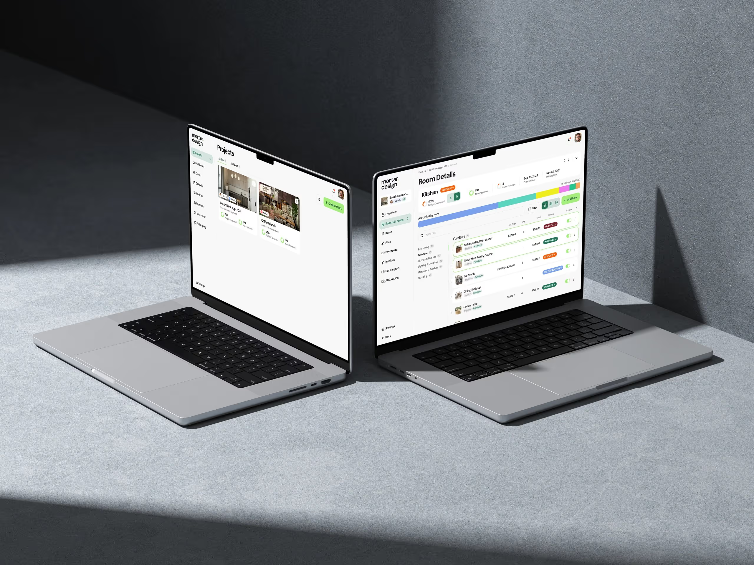
The key insight? Problems worth solving show up as workarounds. When we watched interior designers manage projects, they had spreadsheets connected to Trello boards connected to WhatsApp groups. That's not a workflow—that's duct tape. Those Frankenstein processes are where real SaaS opportunities live.
We document everything in what we call a "Pain Map"—a simple doc listing every curse word, every alt-tab, every "I wish I could just..." comment. This becomes your north star. Not personas or journey maps. Real problems from real users.
The 72-Hour Rule
After each discovery session, we have 72 hours to follow up with a rough concept. Not a pitch deck. Not a requirements doc. A napkin sketch showing how we'd solve their specific problem. This does two things: it validates we actually understood their pain, and it turns them into design partners who'll help shape the product.
Most teams spend months in discovery. We spend two weeks max. Why? Because you learn more from showing people a bad solution than from asking perfect questions. Ship the sketch, get the feedback, iterate.
Stage 2: Core Flow Design (The Make-or-Break Phase)
This is where most SaaS products fail. They try to design everything instead of nailing the one workflow that matters. When we built our recruiting platform, we ignored fancy features like AI screening and focused on one thing: getting resumes from inbox to hiring manager in under 60 seconds.
The product design stages here are brutal in their simplicity. Pick the single most important task your users need to complete. Design that flow. Nothing else. For our content management system, it was publish-to-live in three clicks. For the billing tool, it was dispute-to-resolution in one screen.
We use a technique called "UI Debt Planning." We intentionally design the ugliest possible interface that still solves the core problem. Gray boxes, system fonts, no colors. Why? Because if users get excited about an ugly prototype, you know you've nailed the workflow. Pretty comes later.
The 10-Click Test
Every core flow gets stress tested with the 10-click rule. Can a user complete their primary task in 10 clicks or less? Not 10 unique clicks—10 total clicks including mistakes, back buttons, and confirmations. Most enterprise SaaS requires 25+ clicks for basic tasks. That's why people hate enterprise software.
We map every click in a spreadsheet. Click 1: Login. Click 2: Navigate to feature. Click 3: Start task. Sounds pedantic? Our invoice approval flow started at 23 clicks. We got it down to 7. Usage went up 3x. Clicks matter.
Stage 3: Feature Prioritization (The Art of Saying No)
Here's where things get controversial. We use what I call "Feature Triage"—stolen from emergency medicine. Every feature request gets tagged as one of three things: Critical (product dies without it), Urgent (causes major user pain), or Elective (nice to have). Guess what? 90% of features are elective.
When building our real estate association platform, stakeholders wanted 47 features in v1. We shipped with 6. The other 41? Never built them. Three years later, nobody's asked for them. This is the hardest part of the SaaS design process—saying no to good ideas because they're not critical ideas.
We run a simple exercise with every client. Write down every feature you think you need. Now cross out everything except the three that would make a user switch from their current tool. Those three features are your MVP. Everything else is v2 (which usually never happens because v1 solves the real problem).
The Integration Reality Check
One feature type always makes the critical list: integrations. Your beautiful SaaS product doesn't exist in a vacuum. When we built our HR tech platform, the Slack integration mattered more than our entire onboarding flow. Users don't want another dashboard. They want their existing tools to work better.
We budget 40% of our design time for integration points. Not the APIs—the actual user experience of connecting tools, syncing data, handling conflicts. This unsexy work is what makes or breaks SaaS adoption. Pretty features get demos. Integrations get deployments.
Stage 4: Rapid Prototyping (Building to Learn)
Forget high-fidelity mockups. We build functional prototypes in production code within two weeks of starting design. Not because we're cowboys, but because real feedback only comes from real software. Our design tool? A code editor and a staging server.
The approach is simple. Week 1: Build the core flow with hardcoded data. Week 2: Add just enough UI to be usable. Week 3: Get it in front of 5 users. This isn't about perfection. It's about learning what we got wrong before we've invested months in the wrong direction.
When prototyping our project management tool for interior designers, our first version was embarrassingly basic. No user management. No data persistence. Just the core workflow of creating a project and assigning tasks. One user spent an hour in it and said, "This already saves me 20 minutes a day." That's when you know you're onto something.
The Two-Week Rule
Every prototype lives or dies by the two-week rule. If we can't get something usable in front of users within two weeks, we've overcomplicated it. This constraint forces brutal prioritization. Authentication? Use magic links. Data storage? Local only. Permissions? Everyone's an admin.
These shortcuts horrify traditional product teams. But they're not shortcuts—they're focus. Every hour spent on non-critical infrastructure is an hour not spent validating your core hypothesis. Polish comes after product-market fit, not before.
Stage 5: User Testing in Production (The Only Feedback That Matters)
Most teams do user testing in controlled environments with scripts and observers. We do user testing in production with real data and real consequences. As soon as we have a barely functional prototype, we find 3-5 users willing to use it for actual work.
This approach terrifies risk-averse teams. What about data loss? What about security? What about our reputation? Here's the truth: users are remarkably forgiving when you're solving a real problem. They'll tolerate bugs if the core workflow genuinely improves their day.
We manage risk through what we call "Production Partnerships." Early users know they're using alpha software. In exchange for that risk, they get direct access to our team, immediate bug fixes, and massive influence over the product direction. Some of our best features came from users saying, "This is broken, but what if you..."
The Feedback Loop That Actually Works
Traditional user testing generates reports. Our process generates shipped features. Every Monday, we review user session recordings (with permission). Every Tuesday, we pick the highest-impact fix. Every Friday, it's deployed. This weekly rhythm turns user feedback into user value faster than any survey or focus group.
The key is instrumentation. We track everything: clicks, errors, time-on-task, rage clicks. But we only act on patterns. One user struggling might be user error. Five users struggling is a design failure. This data-driven approach removes ego from design decisions. The users vote with their clicks.
The Reality of SaaS Design: It's Never Done
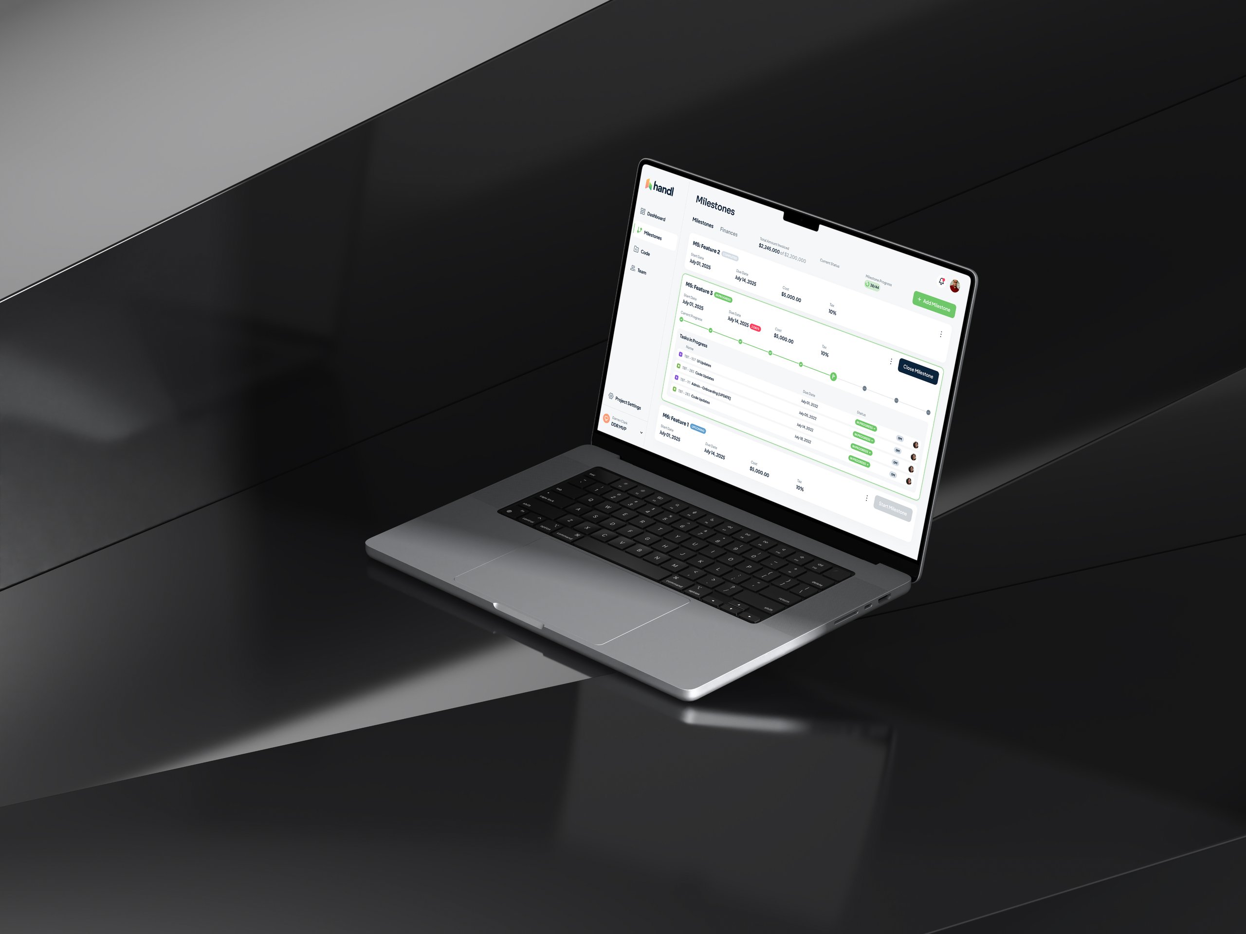
Here's what design blogs won't tell you: the real work starts after launch. Those five stages? You'll cycle through them forever. Our billing platform launched three years ago. Last month, we completely redesigned the core flow based on user behavior we couldn't have predicted.
The best SaaS products evolve through constant contact with users. Not yearly surveys or quarterly reviews. Daily interaction. We maintain Slack channels with our power users. We watch every support ticket. We obsess over usage data. This isn't scalable? Neither is building products nobody wants.
After two decades in this business, I've seen every methodology and framework. They all miss the fundamental truth: great SaaS products come from solving specific problems for specific people. Not from following a perfect process.
Your Next Steps
Want to apply this process? Here's your homework:
First, find 10 people in your target market who are genuinely frustrated with their current tools. Not survey respondents. Real people with real problems. Schedule those calls this week.
Second, commit to the two-week prototype rule. Whatever you're building, get a working version in front of users within 14 days. It'll be embarrassing. Ship it anyway.
Third, measure everything but act on patterns. Individual feedback is interesting. Patterns are actionable. Build your feedback loops around finding and fixing patterns, not addressing every complaint.
The SaaS design process isn't about following steps. It's about staying close to problems and shipping solutions fast enough to learn what actually works. Everything else is just process theater.
At Dazlab.digital, we've used this approach to build everything from AI-native HR tools to specialized billing systems. The products look different, but the process stays the same: find real problems, design focused solutions, ship fast, iterate based on usage.
Ready to build something that actually solves problems? Let's talk about your specific challenge and whether our approach makes sense for your market. No generic solutions. No cookie-cutter processes. Just focused product development for the niche you're trying to serve.
Frequently Asked Questions
What are the 5 stages of product design for SaaS according to Dazlab?
The 5 stages are: 1) Problem Discovery (talking to frustrated users, not market research), 2) Core Flow Design (focusing on one critical workflow), 3) Feature Prioritization (using "Feature Triage" to say no), 4) Rapid Prototyping (building in code within 2 weeks), and 5) User Testing in Production (real users with real data). This process focuses on shipping fast and learning from actual usage rather than perfecting designs in isolation.
Why does Dazlab use a two-week prototype rule?
The two-week rule forces brutal prioritization and prevents over-engineering. If you can't get something usable in front of users within 14 days, you've overcomplicated it. This means using shortcuts like magic links for auth, local storage only, and making everyone an admin. These "shortcuts" aren't actually shortcuts—they're focus on validating your core hypothesis before investing in infrastructure.
What is the "10-Click Test" in SaaS design?
The 10-Click Test ensures users can complete their primary task in 10 total clicks or less, including mistakes, back buttons, and confirmations. Most enterprise SaaS requires 25+ clicks for basic tasks. Dazlab maps every click in a spreadsheet and ruthlessly optimizes. For example, they reduced an invoice approval flow from 23 clicks to 7, resulting in 3x usage increase.
How does Dazlab handle user testing differently?
Instead of controlled testing environments with scripts, Dazlab tests in production with real data and real consequences. They find 3-5 "Production Partners" willing to use alpha software for actual work. These users get direct access to the team and immediate bug fixes in exchange for the risk. This generates real feedback that turns into shipped features within a week.
What's the most important principle in Dazlab's design process?
The core principle is solving specific problems for specific people, not following a perfect process. This means starting with users who "actively hate" their current tools, focusing on one critical workflow instead of feature lists, and maintaining daily interaction with users after launch. The process never ends—even products launched years ago get core flows redesigned based on actual usage patterns.
Related Reading
Dazlab is a Product Studio_
Our products come first. Consulting comes second. Whichever path you take, you’ll see how a small team can deliver outsized results.