7 changes shipped across 2 codebases last week. Another quiet one. Most of it went into making Handl's forecast easier to read.
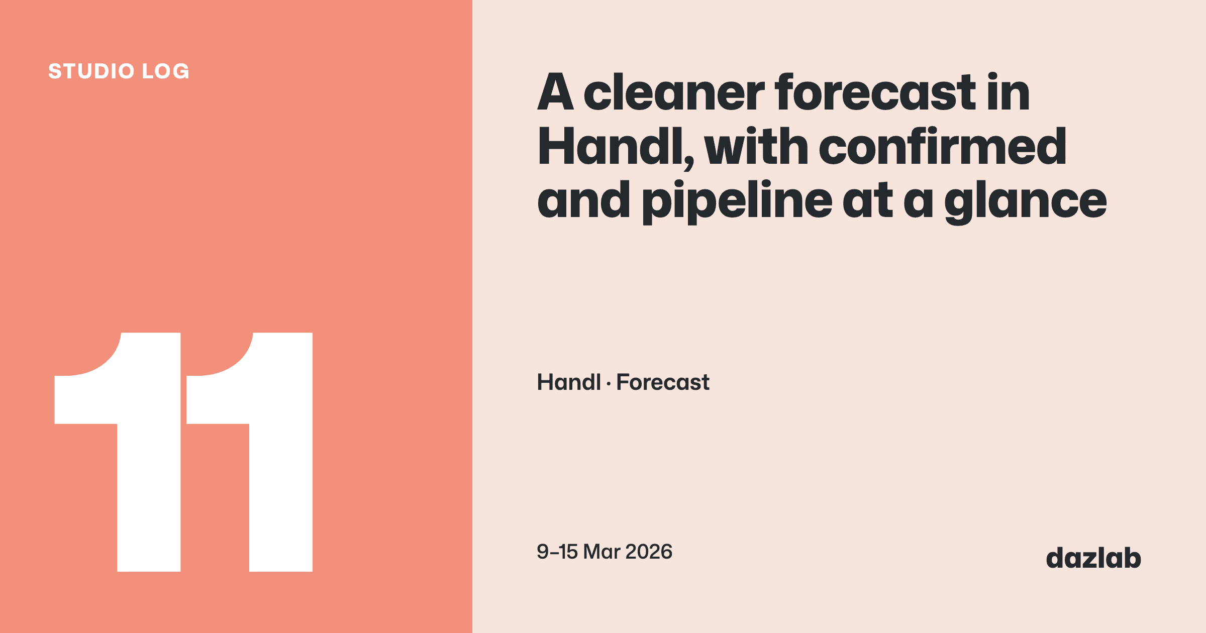
Handl: a cleaner forecast
The forecast is where you go to answer "what's coming in, and when?". This week it got a redesign to match the rest of the dashboard.
Confirmed and pipeline, at a glance. On the calendar, each week's totals are colour-coded: green for confirmed income, orange for pipeline. You can see how much of next month is money you've actually got lined up and how much is still a maybe.
Controls that stay put. The chart type (bar, line, table or calendar) and the Pipeline and Costs toggles now sit on the same row as the Forecast and Pipeline tabs, over on the right. Switch between views and they stay where they are, so you're not hunting for them.
The calendar gets the space. The "Include in Forecast" panel and the legend now sit together on the right, leaving the calendar front and centre, and today is marked with a green ring.
Small changes. But a forecast is something you glance at, and anything that makes the glance quicker is worth doing.
→ See how it works: cash flow · invoice automation → Free: invoice aging and chase tracker → Start a Handl trial
See you next week.
— Daz
 Consulting Inquiries