SaaS feels premium when it's calm, honest and predictable, not when it has the most gradients. Expensive-feeling software never makes you wonder what a number means, what's about to happen, or what your client is seeing. The 12 patterns below are the ones we use across our own products to get that feeling, each with when to use it and where we've used it.
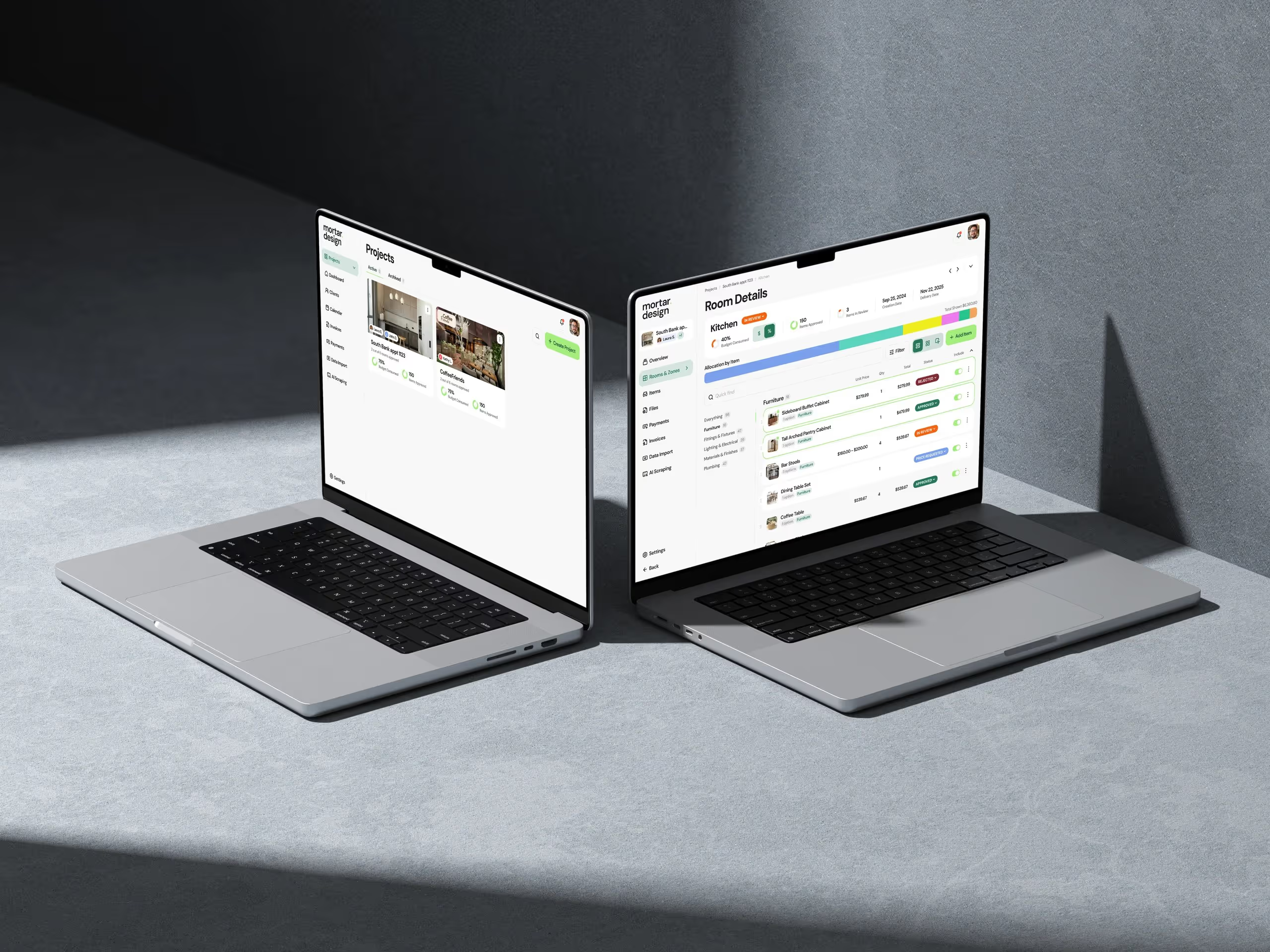
We build and run our own niche SaaS: Handl for agency finance, Mortar for interior designers and Arbeo for hiring. Most of these patterns came out of a specific decision in a specific week, and they're written up as principles in How we build.
What "premium" actually means in B2B software
Visual polish matters, but it's the entry fee. Most of what makes software feel expensive shows up the first time something could go wrong:
- Honesty. Numbers say what they are. Guesses don't dress up as facts.
- Control. Nothing happens in your name that you didn't choose.
- Reversibility. Mistakes are cheap to undo.
- Calm. Fewer decisions, fewer surprises, fewer screens to check.
Each pattern below serves one or more of those.
Honesty patterns
1. Show "—" instead of a guessed number
When data is missing, show a dash, not a zero and not an estimate. A zero says "we know it's nothing". An estimate says "we know roughly". If you don't know, say so.
When to use it: any figure that depends on data the user may not have entered yet: margins, totals, rates, scores.
Where we use it: in Handl, if a project doesn't have cost data yet, its margin shows "—" rather than a guess. A blank margin prompts the agency to add costs. A made-up one quietly gets trusted.
2. Label converted and derived figures
If a number has been converted, estimated or calculated from something else, label it, and let people see how it was built.
When to use it: currency conversion, pro-rated amounts, anything rounded, anything averaged.
Where we use it: every Handl report labels whether its figures are native or converted. Converted amounts use the exchange rate on the date each transaction happened, and on the project Overview you can hover a converted total to see the rates behind it. Time-and-materials invoices also say how time was rounded, on the PDF, the client portal and the email.
3. Never draw a forecast like an actual
Projections and real results shouldn't share a visual style. A dotted line next to a solid one is the minimum. Sometimes the right call is to leave the forecast off entirely.
When to use it: charts that mix history and projection, and dashboards people screenshot for someone else.
Where we use it: Handl's project timeline shows milestones, billing, payments and cost on one time axis, and we chose not to draw forecast cost on it. A projection drawn like an actual is too easy to read as fact, so that chart only shows what has really happened. Forecasts live on the forecast page, where nobody mistakes them for history.
Control patterns
4. Preview as client
If your users have clients who see part of the product, give your users a button that shows exactly what the client sees, before they share anything.
When to use it: client portals, shared boards, anything with different permissions for different viewers.
Where we use it: both Handl and Mortar have "Preview as client". An agency or a designer can check the portal before sending the link, which takes the anxiety out of the moment they hit send.
5. New things start switched off
New features that change what a client sees, or that send anything on the user's behalf, ship off. The user turns them on when they're ready.
When to use it: client-facing views, automated emails, new money settings, anything that changes a number the user has already reported.
Where we use it: when Handl added Tasks and Time tabs to its client portal, they started switched off per project. Every agency shares differently, and nobody should find out about a new feature from their client. Retainer invoices that send themselves and reminder cadences are opt-in too, and so was a tax setting that changes how margin is calculated.
The exception rule: when something does ship on by default, say why in one sentence. Handl's Asset Exchange, which releases final files when an invoice is paid, is on for new projects because nothing reaches the client until the agency sends the invoice. If you can't explain an exception in a sentence, it isn't one.
6. Show exactly what will happen before it happens
Replace "Are you sure?" with a preview of the actual result: who gets the email, who gets skipped, what changes.
When to use it: bulk actions, bulk email, imports, anything irreversible or public.
Where we use it: Arbeo's bulk email shows exactly who will receive it, and who's being skipped because they've already had it, before anything sends. No accidental double emails. In Mortar's Quote Inbox, a supplier quote lands in a holding area where the designer checks the lines before anything touches the project.
7. AI drafts, people decide
AI features should produce drafts that a person approves, never final output that goes straight to a client.
When to use it: any AI that writes, fills in or recommends something the user will be accountable for.
Where we use it: Mortar's assistant can build a first draft of a mood board from a room's products, but it only ever creates drafts. The designer decides what the client sees. In Handl, AI can suggest a project's milestones for the agency to review.
Reversibility patterns
8. Undo windows on automations
If an automation does something that's hard to take back, delay it and let the user's own correction cancel it.
When to use it: automated emails triggered by status changes, scheduled sends, anything kicked off by a drag-and-drop.
Where we use it: Arbeo can email a candidate when they move to a new status, but rules are opt-in per job and wait 24 hours by default. Drag the candidate back before it's due and the email never goes. People drag cards around to think. The delay is what makes the automation safe enough to switch on.
9. Labels, not gates
Show approval and review status clearly, but don't let it block the person who's ready to act.
When to use it: approval steps between two people who aren't the same person, especially where one of them is a customer's customer.
Where we use it: Handl's invoice approval is a label anyone with portal access can set, and you can ask a specific contact to review. It never greys out the pay button. A question on an invoice line doesn't put the invoice on hold either. A greyed-out button because someone's on leave helps nobody.
Calm patterns
10. One plan instead of tiers
Your pricing page is part of the product experience. Every tier is a decision the buyer has to make before they've seen any value.
When to use it: focused products where the tiers split features nobody wanted split, and where every sales call detours into "which plan do I need?".
Where we use it: Mortar moved from three tiers to one plan with everything included (current pricing). Mortar's team roles follow the same idea: owner, admin and member, with no permission matrix to configure. Fewer choices reads as confidence.
11. Keyboard-first navigation and lists that remember your place
Power users judge software by how fast they can get somewhere and whether it remembers where they were.
When to use it: any product people use for hours a day.
Where we use it: Handl has Cmd+K search to jump to any client, project, invoice or quote from anywhere. Arbeo's Applications filter sticks, so a refresh doesn't lose your place, and you can step through candidates with previous and next instead of bouncing back to the list.
12. Accessibility done as a sweep, then locked in
Strong contrast, visible focus states, labelled icon buttons and generous tap targets are what make an interface feel solid. They're also what slips first when someone builds a screen in a hurry.
When to use it: before you call any product "polished", and again every time it grows.
Where we use it: we ran one accessibility sweep against WCAG 2.2 AA across the Handl app, its marketing site and Real Estate Jobs Australia in the same week: contrast on every design token, names on icon buttons, keyboard access for everything, screen reader labels on charts and bigger tap targets. Then we added automated checks so it doesn't slip back. The client-facing screens got their own pass, because a client can't ask you for help with them.
How to apply these to your own product
Don't adopt all 12 at once. Start where trust is most at risk:
- Find the numbers people screenshot. Apply patterns 1–3 there first.
- Find everything that talks to a client or customer on the user's behalf. Apply patterns 4–6 and 8.
- List every decision you ask a new user to make in their first ten minutes, starting with the pricing page. Remove the ones you can (pattern 10).
- Run an accessibility sweep and add checks that fail the build if it slips back.
Our product design audit checklist is a good companion for step four, and the five essential elements of B2B product design covers the foundations underneath.
FAQ
What makes SaaS design feel premium?
Mostly trust: numbers that say what they are, nothing happening in the user's name without their say-so, easy undo, and fewer decisions. Good visual design is necessary, but software looks cheap the moment it surprises someone.
Do these patterns slow down adoption?
Some do, slightly. Features that start switched off and automations with an undo window take an extra step to turn on. We think that's worth it: an automation people trust is one they keep switched on.
Should a dashboard show zero or a dash when data is missing?
A dash. Zero claims you know the value is nothing. A dash says the data isn't there yet, which is honest and prompts the user to fill it in.
Is one pricing plan better than tiers?
For a focused product, often. Tiers make sense when buyers genuinely need different things. When most buyers end up in the middle tier anyway, one plan removes a decision without removing any value.
Where should a small SaaS team start?
With whichever screen users share with someone else, usually a report, an invoice or a client portal. That's where honesty and control patterns pay off first.
Want a product built with these patterns from day one? See how we work.
 Consulting Inquiries